If you are working with Power BI for the first time, the first reflex is to work in a trial and error approach. It can get very frustrating, especially when you realize that after long attempts nothing useful came about and on top of all that, the performance is getting worse and worse. We recommend our customers and students to work methodically and in a structured manner. We have put together the best practice tips that are most important to us:
Power BI Desktop File and Data Import
Put the Power BI Desktop File on OneDrive in order to ensure version control.
Import only the columns that are necessary. Filtering the columns after the import won’t help you to avoid stressing the performance.
In order to avoid calculated columns or measures later on, it should be checked whether calculations can be done in prepared views before importing.
It’s better / faster to have long tables with more rows than wide tables with more columns. Therefore, consider using the unpivoted tables and getting narrow and long tables.
Power BI compresses the data by run length encoding. Run length encoding works best when data is well sorted and there are only a few values. This is the reason, why it makes sense to split a date-timestamp column into two columns.
Data Transformation in Power Query
In order to view and access all functionalities that can be used with M queries, a good way is to open an empty query and enter “= #shared”. A list of all M-Query commands opens then which can be accessed and used by clicking on the respective link.
The data transformation process itself is a good chance to think about the terms to be used for the future reports. Use the terms consistently and consider that report reader will need to understand the terms and potential abbreviations.
Use query folding. With query folding you can shift the load to the preceding data base, e.g. SQL databases. By right clickling “view native query” in the applied steps, you would see the respective SQL code for this step. But consider then that not every transformation in Power Query is possible in SQL, as transforming to “Uppercase”. A step with such a transformation in between would break the query folding and from this time on all steps are harming the performance of your local machine. Therefore these steps should be done last.
Creating the dimension table by duplicating the fact table and removing duplicates helps to ensure consistency of both.
Testing of data by applying filter is a good thing. But it should be ensured that this step will be removed later in the applied steps. Alternatively the data profile, distribution and quality can be validated via checking the respective boxes in the view section.
Data Modelling
Use Star- or Waterfall Scheme is preferred instead of the Snowflake Scheme in terms of performance. This means best case there is one fact table with several dimension tables around it.
It’s recommended to always have a date table in the data model. The date table should have one row per day and columns for month, quarter and year. Further columns in terms of “weekday” vs. “weekend”, “workday” vs. “public holiday” will help in the time intelligence calculations later.
Instead of having two date tables for example in case a relationship for “sales dates” and “ship dates” is needed one date table with one active and one inactive relation is preferred. The inactive relationship can be activated in a DAX measure by using “userelationship” later.
Calculating columns and measures
Whenever possible a measure is preferred over a calculated column. A measure calculates only when it is used in a visualization for the parts of the column while a column is calculated for the whole report and column.
In order to find measures easier there should be one central place for these measures. In case of more than one table you can create a dedicated table for the measures and shift the measures to this place. By changing the “display folder” name you can structure the measures along appropriate folders.
Design Principles in Power BI
Ensure printability: When creating the visualizations, it quickly happens that space runs out on the right or below. But enhancing the page is not the best option when user should be able to print report page. Standard sizes as letter, 4:3 or 16:9 should be used instead of customized page sizes. Also check whether colored backgrounds harm the ability to print the page.
Consider the reading direction: A report is read like a book. Aggregated numbers like tiles should be placed at the top or top left. Detailed information like tables should be placed below.
Decimal places should be used consistently. A manager-friendly view is one decimal place. Use of units in thousands, millions, etc. should be considered.
Visuals per page should be reduced and split to several pages when performance is low.
The performance of every Power BI file should be tested for each custom visual for ensuring fast report time. The test is done by clicking the performance analyzer in the “View” section, start recording and filtering in the visual.
Aligning size and position of visuals by entering the respective pixel value in “Format” and “General”.
Embedding a tile with a date or timestamp to show when the data was refreshed last.
Especially for accounting purposes readers don’t like to see the axis not starting from zero or for proportions in visuals to be skewed.
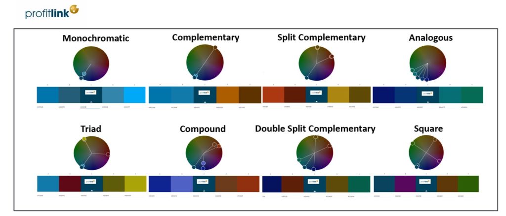
Colors should be chosen carefully. The Adobe Color Wheel helps determine suitable color harmonies. The picture provides an overview of color harmonies for the profitlink dashboards.
Join us in our profitlink trainings Profitlink Power BI Academy to understand more.